


Key Takeaways
- Fintech UX design refers to the process of designing financial products such as banking apps, payment platforms, and investment tools, so every financial action feels clear and easy to follow.
- Fintech UX design focuses on the user experience of a financial product, while UI design covers its visual elements, such as colors, fonts, icons, and layouts.
- UX design builds trust in fintech products, reduces user drop-offs, increases conversion rates, and strengthens customer relationships.
- Good fintech UX design comes down to a few best practices. Test with real people again and again. Use simple language. Make it easy to recover when something fails. Show data in charts that are easy to understand.
People use financial apps and web-based solutions for all kinds of tasks, from checking their balance to making payments or applying for a loan. These tasks should not require much effort to understand. A confusing layout or a missing detail can make a person stop and wonder if they’re doing it right. This is where good fintech UX design makes a difference.
The market reflects the growing importance of user experience. According to the Fortune Business Insights report, the global UX services market is projected to reach $77.18 billion by 2034, with the finance segment expected to account for 27% of the market in 2026.
Businesses investing in fintech mobile app development have a clear reason to pay attention and make usability part of product planning. In practice, it comes down to a few basic questions. Someone sending money wants to know what it costs, where it’s going, and whether it’s safe. Interfaces that answer those questions on screen earn confidence faster.
If you’re building or improving a financial product, this guide will help you understand which fintech UX design principles and practices can make routine actions simpler and give users more reason to trust your app.
What is fintech UX design?
Fintech UX design is the process of designing digital financial products so people can use them easily and understand the actions they take. It applies to products such as mobile banking apps, digital wallets, payment platforms, and investment tools.
The screens must be easy to follow, but the product also has to meet requirements most other apps don’t handle, like identity checks and mandatory disclosures. Since a mistake here costs real money, users need to know what is happening at each step.
Fintech UX vs. UI design: How do they differ?
People often use “UI” and “UX” as if they mean the same thing. They don’t. UI, or user interface, is the visual layer of the product, such as the fonts, colors, icons, and how things are laid out. UX (user experience) is the experience, such as what happens when someone actually uses it, like checking a balance, sending money, or managing an account.
Both matter in financial operations, but a confusing user journey can have consequences beyond frustration. A polished dashboard doesn’t help much if people can’t tell whether a transfer went through or where to find a fee. That is why fintech teams need to consider the steps users take, make important information easy to find, and test these flows with real users to spot problems before they affect more customers.
Why good UX design matters in fintech
When people use a fintech mobile app, they notice how easy or difficult it is to get things done. A confusing sign-up or unclear payment step can put them off. With 72% of businesses prioritizing user experience, UX design for fintech has become an important consideration.
Let’s look at the difference it can make for financial businesses.
Building user trust and confidence
When someone makes a payment, they want to know it went through. If the app doesn’t show a clear confirmation or explain an extra charge, they may start to worry.
Good fintech UX design makes these details easier to understand, so users know what’s happening with their money and feel more comfortable using the app.
Reducing onboarding drop-offs
Many users do not give a new app a second chance. If registration drags, with endless fields and repeated requests, they leave. A simple onboarding process tells people what to do next, and a sound fintech architecture makes sure verification steps don’t lag.
For a business, that means fewer abandoned sign-ups and more completed accounts.
Boosting conversion rates
Conversions are often lost at a single moment. A visitor weighing a loan reads the terms, looks for the next step, and finds nothing obvious. They leave. In loan management software, the terms and the next step should sit on the same screen. Clear screens at these decision points are a plain, practical way for a fintech business to turn visitors into customers.
Strengthening customer retention
Customers may not think much about an app when everything works as expected, but they notice when simple tasks become difficult. They want to check their money, track payments, and manage accounts without unnecessary effort.
Designing for fintech with these needs in mind can make an app part of a customer’s regular routine, helping businesses build loyalty and reduce customer churn.
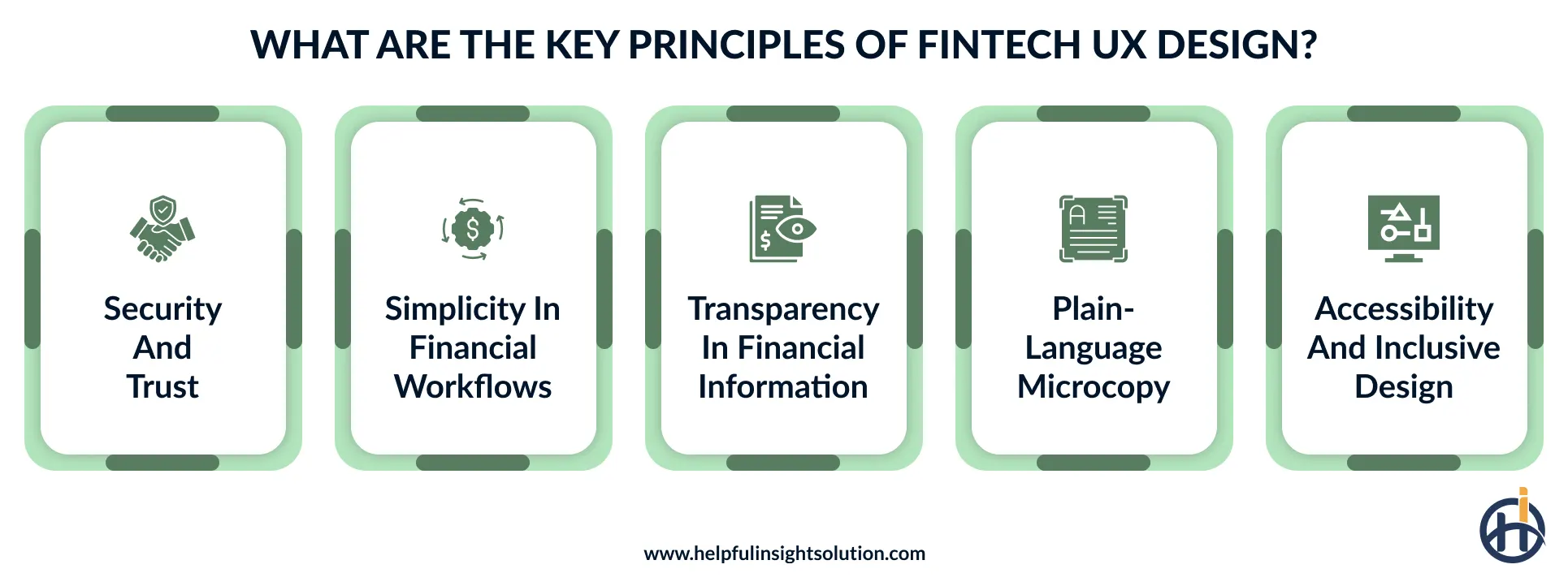
What are the core principles of fintech UX design?
Ask customers why they stick with a financial app, and the answer is rarely about features. It’s that the app made sense. Balances were easy to find, a payment did what it said, and nothing felt confusing.
Businesses get there by following a few sound fintech app design principles, and customers notice the difference.
Security and trust
It’s natural for people to be cautious when accessing their money online. A security step only helps if the person understands it. Say a login triggers an extra verification prompt. A short line explaining that it’s to protect their account keeps them calm, while silence makes them suspect something is wrong.
Biometric login and security alerts can also help protect accounts, but they need to be easy to use. A reliable fintech user experience should support cybersecurity in fintech without making simple tasks, such as checking a balance or reviewing a payment, more difficult.
Simplicity in financial workflows
Interest rates, service fees, and repayment terms take a while to understand. These details cannot be left out, but they do not need to overwhelm users either. That’s what simplicity in financial UX design comes down to. Familiar menus, labels that say what they mean, and a line or two of explanation go a long way.
Transparency in financial information
A user might be happy to pay a transfer fee, as long as they know about it beforehand. The same goes for exchange rates and delays. If the details sit right next to the pay button, there’s nothing to argue about.
UX design for fintech also needs to show a quick update whenever the payment status changes.
Plain-language microcopy
The small pieces of text in an app often get overlooked during design, but users rely on them throughout a task. A button labeled “Continue” may be fine in one place, while a more specific label is needed before confirming a payment.
Error messages need the same attention. If a transaction cannot be completed, explain the problem in everyday language and tell the user what they can try next.
Accessibility and inclusive design
Financial services should be usable by people with different abilities, ages, and levels of digital experience. Some people have poor eyesight, some are older, and some can’t use a touchscreen at all.
Following Web Content Accessibility Guidelines (WCAG 2.2, level AA) helps teams make text easier to read, support keyboard navigation, and build financial platforms that more people can use.
UX design thinking for banking and financial services
Design thinking for the banking sector starts with understanding what people struggle with when using financial products. Instead of assuming what customers need, design teams look at how they manage money, where they get stuck, and what makes them hesitate before completing a transaction. This helps teams make practical design decisions.
The process often includes a few key steps:
Empathize: Talk to customers and watch where they struggle, such as at ID upload.
Define: Name the real problem, for example, “applicants quit before submitting.”
Ideate: Sketch several ways to fix it, like fewer fields or auto-fill.
Prototype: Build a simple clickable version of the best idea.
Test: Put it in front of real users, fix what they stumble on, and repeat.
This approach keeps real customer needs at the center of UX design in financial services.
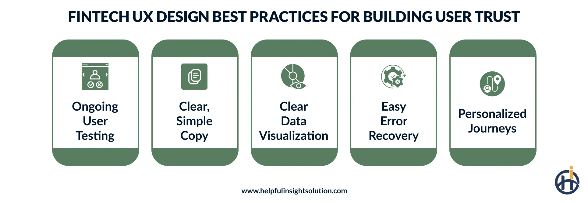
Fintech UX design best practices to build user trust
Designing a financial app means thinking about more than its appearance. Users need to understand what they’re doing, find important information, and feel comfortable before making financial decisions.
The following fintech app design best practices give designers practical ways to improve the experience and make everyday financial tasks easier for customers.
Continuous user research and testing
Don’t assume people will use a financial platform the way you expect them to. Ask a few users to make a payment or find a transaction, then watch what happens. Do they miss a button? Do they stop to reread an instruction?
These small moments tell you a lot. Use usability testing to spot such problems and fix them before they affect more users.
Use clear, jargon-free copy
A message like “payment authorization unsuccessful” can leave users wondering what happened to their money. A simple “Your payment didn’t go through. Please try again” is much easier to understand.
This is a small but useful step when designing for fintech. And if a technical term can’t be avoided, put a short explanation right beside it, where the person is actually looking.
Visualize financial data clearly
A long list of numbers doesn’t tell users much about their spending habits. A simple chart showing monthly expenses can make it easier to spot where most of their money goes. When planning financial data visualization, use charts and graphs that answer real questions.
The right IT services for the finance industry can help build dashboards that make financial information easier to read and compare.
Design clear error recovery paths
A failed payment can show an error code and leave users unsure whether the money has left their account. Most users do not know what an error code means. When something breaks, say so in one clear line.
Then point to the next move, whether that’s checking the transaction or trying once more. Keep a support link close by for repeat failures. Fintech UI/UX design earns trust in exactly these small moments.
Personalize the user journey
Generic banners are easy to ignore. A reminder that says “your electricity bill is due Friday” is more likely to catch someone’s attention. That’s what personalization looks like in practice.
Show users spending summaries based on their habits, reminders for bills they regularly pay, or updates that match their interests.
Fintech app development services can support this by connecting relevant transaction details with the features users see, while keeping their data and preferences in mind.
What are the common challenges in fintech UI/UX design?
Designing a financial product involves more than making screens easy to use. Designers must consider customer expectations, security, and financial regulations without making everyday tasks difficult. These fintech UX design challenges can affect how people use a platform and whether they trust it.
Below, we look at common problems and how to address them.
Balancing security and usability
Users may understand why a financial platform needs security checks, but that does not mean they want to go through them at every step. Too many checks can interrupt a simple payment. Too few can put accounts at risk. Finding the right balance is a key challenge in fintech UX design.
The solution
Use biometric login, such as fingerprints, for routine access and ask for extra verification when a user makes a high-risk transaction. Fintech design services can help map out which actions get which check without slowing down routine tasks.
Meeting compliance without breaking flow
KYC checks, document uploads, and legal consent screens are not optional in finance. They are also where many people quit. A new user who can’t tell how many steps remain, or why each one is needed, often leaves. Designers have to make the steps clear without dropping any of them.
The solution
Break the process into small steps with a visible progress indicator, and use auto-fill from scanned documents. Each screen then feels quick. A thoughtful fintech user experience lets users clear compliance without losing momentum or interest.
Designing for high-stress moments
Money problems feel urgent. When a payment doesn’t go through, or an alert says something looks suspicious, people want answers right away.
Poor screens make it worse. A message like “something went wrong” doesn’t say if the payment worked or if the account is safe, so customers panic and often leave.
The solution
Say plainly what happened and what to do next. Show the payment status right on the screen, like “pending” or “failed,” and put a support link next to it. Nobody should have to hunt for the next step.
Fintech UX trends redefining financial app experiences
The way people manage money online keeps changing. They now expect fintech platforms to offer more than basic payments and account checks. New tools and changing customer needs are shaping financial UX design in 2026. Let’s look at the UX design trends influencing fintech product experiences.
AI-driven personalization
AI is changing financial apps from places where people simply check their balance into tools that can offer help at the right time. By learning from spending habits and regular payments, an app could warn users that rent is due when their balance is running low or suggest moving a small amount into savings. AI development services can help fintech businesses build these personalized financial experiences around users’ everyday needs.
Conversational and voice interfaces
Most people would rather ask than search. Type “Why was I charged this fee?” into an AI chatbot and it points to the right transaction, with no menu-hopping. Voice works the same way for small jobs, like checking a balance or sending money to a saved payee.
That’s why conversational interfaces are becoming a normal part of financial services UX, because asking is faster than searching.
Privacy-first data experiences
Before linking a bank account to a budgeting app, people may want to know exactly what information they’re sharing. If the app hides this in lengthy terms, users may hesitate.
Simple permission settings and clear explanations make the choice easier. This is one way privacy-first design supports a professional financial platform user experience.
Adaptive and context-aware home screens
Open a banking app on payday, and the first thing you see is the bills coming due. Open it at an airport and travel options move up. That’s what a context-aware home screen does.
It rearranges itself around the time, place, and recent activity. UX design for fintech is shifting toward this, since fewer taps mean less hunting and less clutter.
Should you hire a fintech UX design partner?
A financial product has to do more than look good. Customers need to understand the fees, get through identity checks, and trust the app with their money. If they keep abandoning the process halfway, that’s usually the point to bring in experienced fintech designers.
Designers offering UI/UX design services for financial products can pinpoint what confuses people and smooth out the journey.
Hire fintech designers when:
- Users abandon sign-up or KYC steps, and nobody knows the reason
- In-house team lacks experience with financial product design
- Support tickets keep rising because customers misread screens or miss key details
- Payment, transfer, or loan flows feel too long or confusing to complete
- Competitors’ apps feel clearer and more trustworthy than yours to new users

How Helpful Insight approaches fintech UX design
People don’t want to spend time figuring out how a financial app or software works. They want to check a payment, review their expenses, or apply for a loan without getting stuck along the way. That’s why fintech UX design needs to consider the actual tasks people carry out, not just how the screens look. Even small points of confusion can affect how comfortable someone feels using a financial product.
At Helpful Insight, we look at a financial product from the user’s point of view. We consider what customers need to do, which steps might cause trouble, and where the design needs to be clearer.
As a trusted financial software development company, we provide fintech UX design services for businesses and startups building new products or improving existing ones. We aim to make financial tools easier to understand and use while keeping business needs and security requirements in view.
Connect with our team today to share your fintech UI/UX design service requirements.
Frequently Asked Questions
Fintech UX design typically costs $20,000 to $150,000 or more, depending on the project scope. A UX audit may cost $2,000 to $10,000, while full product design can range from $40,000 to $120,000 or more. Costs depend on app complexity, features, research needs, and regulatory requirements.
A basic fintech app can take around 2 to 5 weeks for UI/UX design and prototyping. More complex products may need 1 to 3 months or more, especially when they involve multiple user journeys, detailed design systems, and usability testing.
Fintech UX success can be measured by tracking how many users complete tasks, where the rest quit, and whether they come back next week. Then read the feedback. Satisfaction scores and support requests point to the screens that still confuse people. Common metrics include task completion rate, drop-off rate, time on task, and a System Usability Scale (SUS) score.
Figma, Sketch, ProtoPie, and Axure are common tools for designing and prototyping financial products.