


Flutter, a robust and reliable SDK by Google, excels in cross-platform mobile app development. It is highly regarded for creating high-performance applications that are easy to maintain. Central to the Flutter ecosystem are its widgets, which play a vital role in developing next-gen applications efficiently, saving both time and frustration.
In this blog post, we will delve deeply into the essential aspects of the best Flutter widgets. Additionally, we will explore the top 17 Flutter widgets that are invaluable for building fast and efficient business applications.
What are Flutter Widgets?
Flutter is considered as one of the best framework for cross platform application development which is due to its simplicity of development, fast performance, powerful community and many more.
The only thing which differentiates flutter from the other cross platform frameworks is its wide variety of the widgets. This Flutter tutorial explains how to use a flutter widget as the user interface(functionalities we provide) of our application.
A widget is an element in the UI that encompasses all of the visual elements on the screen (text fields, images, buttons…). Official Flutter widgets are very lightweight, highly reusable & compositional
. In this cheat sheet I have listed all the valuable Flutter widgets our group uses for our undertaking improvement, so you can likewise utilize them to pick the correct gadgets for your business application improvement and can join more modest widgets to make more intricate UIs.
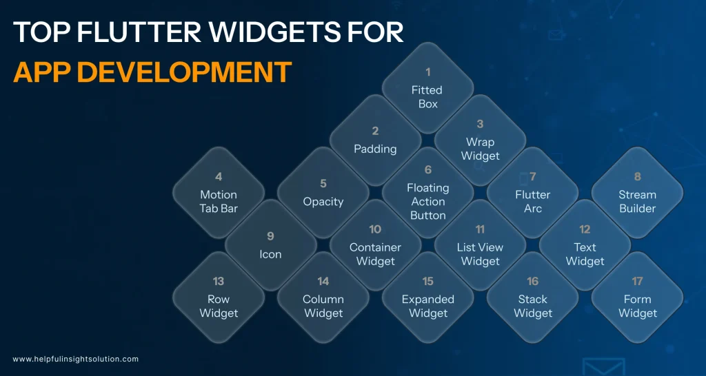
Top 17 Flutter Widgets for App Development in 2026
Development In summary, with flutter, you have a complete ecosystem of libraries, tools, packages, and plugins for business application development. It all comes packed with a range of widgets too, setup to improve user engagement.
In this post, we listed 17 crucial Flutter widgets that can make your work easier as a developer and provide better user experience.
#1 FittedBox
FittedBoxReactive widget scales a single child widget to fit within bounds similar to css, but in reactive. You should use this widget then you have a row inside a few containers and you want to restrict your row to clip the overflow. Putting the child widget inside a FittedBox, will make sure it will be aligned in the correct place, with
#2 Padding
The Padding widget encapsulates other widgets to provide padding in specified directions. You can also apply padding uniformly in all directions. For instance, in the example below, the Padding widget adds 6.0 units of padding around a Text widget on all sides.
#3 Wrap Widget
A widget that arranges its children in multiple horizontal or vertical runs, wrapping the children onto the next line and column when there is not enough space in the current run. This is perfect for creating tag clouds or dynamic chip groups where items should shift to a new row or column when there is not enough space. For example, this keeps the design clean and unbloated.
#4 Motion Tab Bar
Motion Tab Bar Widget adds motion and animation for your tab bar so that our app looks cleaner. This widget uses motion animations to spice up tab interaction.
#5 Opacity
The Opacity widget allows you to make its child partially transparent. It works by rendering the child into an intermediate buffer and then blending it back into the scene with the specified transparency.
#6 FloatingActionButton
The FloatingActionButton (FAB) has a floating property as name convention and takes precedence over the main content of the app to complete an important action. We obviously want to give this button more emphasis and to do so we place this button as the main focused action button of the main scaffold widget.
#7 Flutter Arc
Text Top Features Of Flutter Arc TextFlexible Programmable Emotion Method. With the text along an arc, developers can display text on a curved path, which opens up lots of possibilities for interesting layouts where the text follows a circular trajectory. With the freedom of changing the angles developers can place content exactly on the arc which pretty much makes the app look great.
#8 StreamBuilder
StreamBuilder is a vital widget in Flutter, primarily meant to handle real-time data synchronisation. Thanks to Dart language, streams are finally natively and beautifully supported, and the lovely handling of asynchronous data streams in general. This leading-edge widget serves best when it comes to applications with ongoing updates of data and thus it serves as a tunnel where data goes in from one end and comes out in another end.
Read Also:- Cost to Develop A Mobile App: Comparing Native, Cross-Platform & Hybrid Apps
#9 Icon
The Icon widget in Flutter is used to display graphical icons. It supports a variety of built-in icons from the Material and Cupertino icon sets, and custom icons. The widget is highly customizable, allowing adjustments to size, colour, and semantic labelling, making it a versatile component for enhancing app interfaces.
#10 Container Widget
Container widget in flutter or we can say container class it is a multi use convenience widget and it is also one of basic essentials of flutter. It could be a widget as well, and below will lay out one or more widgets on the screen when requested.
It provides a wide variety of properties like padding, margin, height, width, decoration, which can be used to a large extent to make your user interface more good looking and functional at the same time, using them effectively you can perfectly align your UI elements.
#11 ListView Widget
This is used for creating a scrollable list of child widgets, such as for displaying a large amount of vertically or horizontally arranged children which are link a list. It helps with fixed and dynamic lists, with horizontal and vertical scrolling.
#12 Text Widget
In Flutter, Text widget is a basic widget which is used to display a paragraph of short text within your application. It allows developers to customize everything from color, font size, weight, spacing, and more.
Control text alignment and overflowText can be aligned and overflow managed, so text strings work seamlessly within the flow of the document and enhance the UI. Text is the most versatile widget doing everything from displaying labels, user input display or just instructions within the application.
#13 Row Widget
Row is used to create horizontal layout by which we can align widgets in Row at the same side of Main Axis. To have the UI as responsive and neat as possible, it gives attributes to manage the layout of the children (mainAxisAlignment and crossAxisAlignment). Row : Developers can use this widget to setup horizontal lists, navigation menu, and for placing the widgets such as icons and text next to each other.
#14 Column Widget Column
The Column Widget is the Vertical Axis counterpart to the Row widget, aligning its children along the main Axis from top to Bottom. Row: A widget whose children are positioned in a row, sharing properties with the Row widget, like alignment and flexibility.
#15 Expanded Widget
The Expanded widget is a crucial element in Flutter’s UI toolkit, particularly important for responsive design. It works in conjunction with Row and Column widgets to proportionally distribute space among child widgets.
This ensures effective use of available space, preventing overflow and maintaining a balanced layout. Mastery of the Expanded widget is essential for developers aiming to create flexible and adaptive user interfaces.
#16 Stack Widget
The Stack widget offers a unique approach to layout design in Flutter, enabling developers to overlay widgets on top of one another, creating a layered structure.
This is particularly useful for scenarios requiring absolute positioning, such as placing badges over icons or creating carousels with overlaid text. By manipulating the z-axis, the Stack widget adds depth and complexity to app UI/UX designs, enhancing the visual appeal of the user interface.
#17 Form Widget
The Form widget is pivotal for collecting user input in a structured and controlled manner in Flutter. It simplifies form creation and includes built-in validation to ensure submitted data meets required criteria.
Development teams can leverage the Form widget to create cohesive, user-friendly forms, complete with error messages and input formatting, thereby improving the overall user experience.
Read Also:- 10 Outstanding Apps Created Using the Flutter Framework
13 Categories of the Best Flutter Widgets
- Text and Typography Widgets: Widgets like Text, RichText, and DefaultTextStyle provide extensive options for displaying and styling text, making it easy to customize fonts, colors, and other text properties.
- Button Widgets: ElevatedButton, TextButton, IconButton, and FloatingActionButton are crucial for adding interactive elements to your app, providing users with clickable options.
- Input Widgets: TextField, Form, Checkbox, Radio, and Switch widgets facilitate user input, enabling the creation of forms and other input mechanisms.
- Image and Icon Widgets: Image, Icon, and ImageIcon widgets help integrate visual elements, allowing the display of pictures and icons seamlessly within your app.
- List and Grid Widgets: ListView, GridView, and ListTile are perfect for displaying collections of items, whether in a scrollable list or a grid layout.
- Scrolling Widgets: SingleChildScrollView, Scrollbar, and CustomScrollView enhance the app’s navigability, making it easier for users to browse through content.
- Animation and Motion Widgets: AnimatedContainer, AnimatedOpacity, Hero, and FadeTransition add dynamic interactions and smooth transitions, enhancing the user experience.
- Dialog and Modal Widgets: AlertDialog, SimpleDialog, and BottomSheet manage pop-ups and modals, providing ways to alert users or gather input without navigating away from the current screen.
- Navigation Widgets: Navigator, Drawer, BottomNavigationBar, and TabBar facilitate movement within the app, ensuring users can easily navigate between different sections.
- Data Visualization Widgets: Various chart libraries, along with ProgressIndicator, LinearProgressIndicator, and CircularProgressIndicator, help display data graphically and track progress.
- Styling and Theming Widgets: Theme, ThemeData, and ColorScheme widgets enable consistent and customizable app design, allowing for a unified look and feel.
- Gesture Detection Widgets: GestureDetector, InkWell, and Draggable detect and respond to user interactions, making it possible to implement custom gestures and draggable elements.
- Miscellaneous Widgets: FutureBuilder, StreamBuilder, Tooltip, and Spacer address unique development needs, helping developers handle asynchronous data, provide tooltips, and add spacing to layouts.
FAQs
The essential Flutter widgets for creating responsive layouts include Row, Column, Stack, and Expanded. These widgets allow you to organize and structure your app’s user interface efficiently, ensuring it adapts well to different screen sizes and orientations.
To incorporate user input, you can use widgets like TextField, Form, Checkbox, Radio, and Switch. These widgets help in collecting and managing user data through forms, toggles, and selection controls, making it easy to gather and validate information from users.
ListView and GridView are highly recommended for displaying lists and grids. ListView is ideal for creating scrollable lists of items, while GridView is perfect for displaying items in a grid format, making it easy to manage and present large sets of data.
For adding interactive elements, widgets like Elevated Button, TextButton, IconButton, and FloatingActionButton are crucial. These widgets provide various styles and functionalities for creating clickable buttons and interactive components, enhancing user engagement.
To implement animations and transitions, you can use widgets such as AnimatedContainer, AnimatedOpacity, Hero, and FadeTransition. These widgets allow you to add dynamic interactions and smooth transitions, improving the overall user experience and making your app more visually appealing.


